一直对CSS3中的渐变用的不是很好,PHotoShop上面经常会用渐变来做高光,起到看上去有立体感的作用。
渐变在Web2.0中得到的充分的利用,我一个同学开玩笑说,Web2.0就是高光。
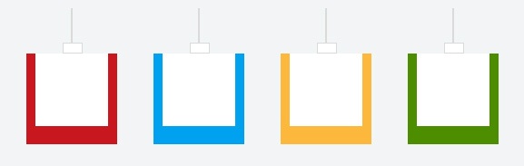
今天研究一个渐变的教程,当然还用到了其他的元素。圆角,阴影,旋转等。
原文地址:How to Create CSS3 Christmas Tree Ornaments 演示地址:
CSS的成分
1、 :before and :after 伪元素的使用。
2、 CSS3的线性和径向 渐变 :为了得到金属色填充和装饰品闪耀的,我们将使用颜色渐变。
3、 阴影,旋转,圆角等元素的组合。
Html很简洁,我本以为要多些点的,主要是其中使用伪元素,减少了很多的Html代码。
<ul id="bauble-container">
	<li>
		<div class="bauble red-bauble"></div>
	</li>
	<li>
		<div class="bauble blue-bauble"></div>
	</li>
	<li>
		<div class="bauble yellow-bauble"></div>
	</li>
	<li>
		<div class="bauble green-bauble"></div>
	</li>
</ul>
CSS3
/* General */
html
{
	background: #f2f5f6; /* Fallback background color if gradients are not supported */
	background: -moz-linear-gradient(top, #f2f5f6, #c8d7dc);
	background: -webkit-gradient(linear,left bottom,left top,color-stop(0, #c8d7dc),color-stop(1, #f2f5f6));
	height: 100%;
}
#bauble-container
{
  list-style: none; /* Remove predefined bullets */
  width: 568px; /* Actual list width after summarize widths, margins and borders */
  margin: 150px auto; /* Now that we have the width, let's center it */
  padding: 0; /* In production, this may not be needed if you reset your styles in your global stylesheet:
                 http://sixrevisions.com/css/css-tips/css-tip-1-resetting-your-styles-with-css-reset/ */
}
#bauble-container li
{
  margin: 0 20px; /* Let's add some space */
  float: left; /* Place them in line */
}
/* This is the part where the Christmas bauble string is added */
#bauble-container li:before
{
	content: "";
	background: #dadada; /* Fallback */
	background: -moz-linear-gradient(bottom, #9c9c9c, rgba(255,255,255,0) );
	background: -webkit-gradient(linear, left bottom, right top, from(#9c9c9c), color-stop(100%, rgba(255,255,255,0)));
	height: 50px;
	width: 2px;
	display: block;
	margin: 0 auto;
}
/* Rotate them */
#bauble-container li:nth-child(odd)
{
	-moz-transform: rotate(-5deg); /* Firefox */
	-webkit-transform: rotate(-5deg); /* Chrome and Safari */
	-o-transform: rotate(-5deg); /* Opera */
	-ms-transform: rotate(-5deg); /* Surprise! IE9 with its own transform prefix */
}
#bauble-container li:nth-child(even)
{
	-moz-transform: rotate(5deg);
	-webkit-transform: rotate(5deg);
	-o-transform: rotate(5deg);
	-ms-transform: rotate(5deg);
}
/* Style the bauble */
.bauble
{
	-moz-border-radius: 100px;
	border-radius: 100px;
	-moz-box-shadow: 0 0 5px #777777;
	box-shadow: 0 0 5px #777777;
	-webkit-box-shadow: 0 0 5px #777777;
	border: 1px solid rgba(0,0,0,0.3);
	position: relative;
	height: 100px;
	width: 100px;
}
/* Style the bauble head */
.bauble:before
{
	content: "";
	background: #fff; /* Fallback */
	background: -moz-linear-gradient(left, #fff, #9c9c9c, #fff, #9c9c9c );
	background: -webkit-gradient(linear, left center, right center, from(#fff), color-stop(25%, #9c9c9c), color-stop(50%, #fff), color-stop(75%, #9c9c9c));
	-moz-border-radius: 2px;
	border-radius: 2px;
	-moz-box-shadow: 0 1px 0 rgba(0,0,0,0.2), 0 -1px 0 rgba(255,255,255,0.3) inset;
	box-shadow: 0 1px 0 rgba(0,0,0,0.2), 0 -1px 0 rgba(255,255,255,0.3) inset;
	-webkit-box-shadow: 0 1px 0 rgba(0,0,0,0.2), 0 -1px 0 rgba(255,255,255,0.3) inset;
	border: 1px solid #dadada ;
	height: 10px;
	width: 20px;
	position: absolute;
	left: 50%;
	top: -12px;
	margin-left: -10px;
}
/* Add bauble light reflection */
.bauble:after
{
	content: "";
	-moz-border-radius: 100px;
	border-radius: 100px;
	background: #fff; /* Fallback */
	background: -moz-linear-gradient(bottom, #fff, rgba(255,255,255,0.1) );
	background: -webkit-gradient(linear, left bottom, right top, from(#fff), color-stop(100%, rgba(255,255,255,0.1)));
	position: absolute;
	top: 0;
	left: 50%;
	margin-left: -40px;
	opacity: 0.15;
	height: 80px;
	width: 80px;
}
/* Colorize them */
.red-bauble
{
	background: #c8171f;
	background: -moz-radial-gradient(center 45deg,circle cover, #f9d0be, #c8171f);
	background: -webkit-gradient(radial, 40% 40%, 0, 40% 40%, 50, from(#f9d0be), to(#c8171f));
}
.blue-bauble
{
	background: #00a1ee; /* Fallback */
	background: -moz-radial-gradient(center 45deg,circle cover, #cde6f9, #00a1ee);
	background: -webkit-gradient(radial, 40% 40%, 0, 40% 40%, 50, from(#cde6f9), to(#00a1ee));
}
.yellow-bauble
{
	background: #fcb83d; /* Fallback */
	background: -moz-radial-gradient(center 45deg,circle cover, #fcf3a6, #fcb83d);
	background: -webkit-gradient(radial, 40% 40%, 0, 40% 40%, 50, from(#fcf3a6), to(#fcb83d));
}
.green-bauble
{
	background: #4d8d00; /* Fallback */
	background: -moz-radial-gradient(center 45deg,circle cover, #d1e5b2, #4d8d00);
	background: -webkit-gradient(radial, 40% 40%, 0, 40% 40%, 50, from(#d1e5b2), to(#4d8d00));
}
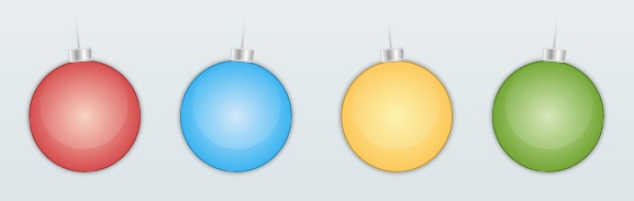
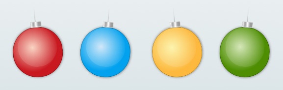
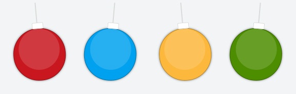
比较各Web浏览器下CSS3绘制彩灯的效果:
FireFox3.6.13
Chrome8.0.552.224

Safari5.0
Opera11.00
IE9 Beta
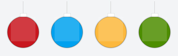
IE8


好久没看到这么热心的博主了
一条条回复留言 挺你
@朱定聪其实CSS3并不那么复杂,有构思就行了。
CSS3 真的是很强大啊
@周超貌似你是用的emlog,我这个是WordPress哎
@William我知道你是 wordpress 你技术比较好 应该能找到 冲突的 能帮忙看下么
忽然想到一件事,如果IE也随波逐流了,我们这些只会PS软件不会CSS3的以后是不是太没地位了???
强烈建议,所有浏览器都不支持CSS3,估计很多设计师心里都会平衡些嘀嘛……
纯属个人观点,不许争论……
@song哈哈,IE9已经支持CSS3,不过一些渐变IE9 RC还不支持,不知道是不是我代码的问题。
好棒哦!
css3好强大啊 万恶的IE
这IE真的很操蛋,诶,还真有点立体感,很不错。。。
@阿鼎恩啊,CSS3就是强大。
过来看看